Project Management Software Showdown: Monday vs. Asana
- Get link
- X
- Other Apps
To help us manage our daily tasks, deadlines, and projects, we have the luxury of turning to project management software rather than Post-it Notes or endless email threads.
The demand for project management tools is high, with heavyweights like Microsoft, Atlassian, and Basecamp often dominating the conversation. But there are two other players worth considering for their ease of use, task management features, and third-party integrations: Asana and Monday.
Here's how they stack up.
Common Features and What We Looked For
Asana and Monday offer multiple ways to streamline your projects, from jumpstarting your work with templates to centralizing team communication. But the two apps offer different experiences in terms of user interface, work visualization, and enterprise-level features. The best app for you will depend on the complexity of your project and how many people you're collaborating with.
Here are six features we'll be comparing to help you make your choice. Click on the section that matters most to you or go directly to the comparison table.
User Interface
Both apps make it easy to add new tasks to projects, but Asana offers a more intuitive experience.
Asana's side navigation is simple and to-the-point, with friendly icons and labels to help guide you to the right area, from your inbox to reports. If you ever manage to get lost, the Home screen is where you'll find your most urgent tasks with upcoming deadlines and recent projects.
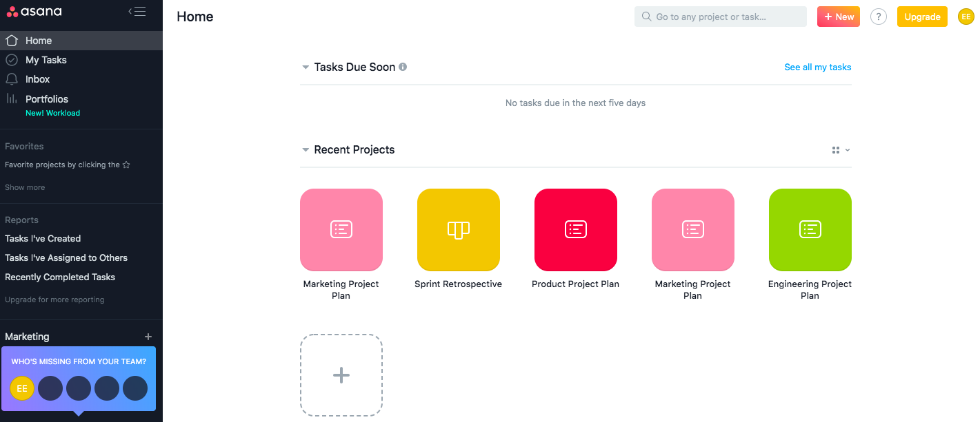
Within a project, there's a big, blue button that lets you add tasks, or you can simply click into the body of the project to add content. The top navigation quickly shows you other features, like switching project views, starting a conversation, or building a form.
If you're using Asana for the first time, there's one thing that isn't immediately intuitive. Within a project in the default list view, you'll see an overview of all your tasks. You need to click on a task to open a side window that displays all the task details.
Monday's interface is harder to master. The app's default screen shows your inbox, boards (or project plans), and dashboards—a helpful screen to reference if you get confused. The side navigation just displays icons, which aren't easy to understand (for example, a lightning bolt icon represents "Boltswitch," which allows you to switch to a different board).
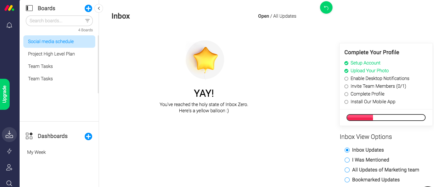
Once you open a board, it's easy to understand how to add new tasks, details, or columns, or switch views, but that's where the simplicity ends. The interface is minimal, to its detriment. There are five icons in the upper-right corner, all without labels, so you have to continue to hover or click on them to remember what they do.
Asana and Monday offer iOS and Android apps, letting you manage tasks on the go. With both apps, you can create new projects and tasks, view status, and communicate with your team.
Templates
Both apps offer templates, but Monday's templates are more robust with real-life content examples.
Asana offers dozens of templates to help you get started faster. By default, Asana displays templates related to the industry (marketing, product, design, IT, operations, etc.) you selected when you created an account. You can toggle between other template types or even search for templates you or your team created. When you decide to use a template, there will be a Read Me section with instructions for using it as well as brief example content within the template as a starting point.

Monday also offers templates grouped by industry, but, unlike Asana, its templates don't just include a few entries of example content—they mimic an actual project plan with real content. A project plan template in Asana displays three total example tasks, with no owner, description, or due date. A project plan template in Monday, on the other hand, shows seven tasks, with three tasks completely filled in for owners, design status, development status, approval, timeline, and progress. This brings the template to life, helping you immediately understand Monday's features.
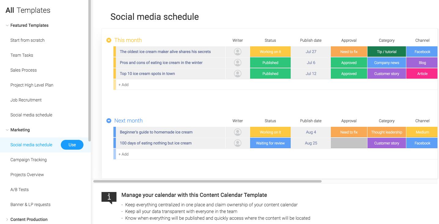
Monday's templates don't include the same tips and getting started instructions that Asana offers, but the robust templates make up for it.
Task Management
Asana offers fast, streamlined task creation. Monday is clunkier, but shows you more details at a glance.
Asana has made task management as easy as possible, building multiple ways to create new tasks and track their status. Rather than go into each individual project plan whenever you want to add a corresponding task, a pop-up window appears where you can enter the task name, owner, and description, and select the project from a dropdown list. Asana automatically adds that task to whichever project you choose.
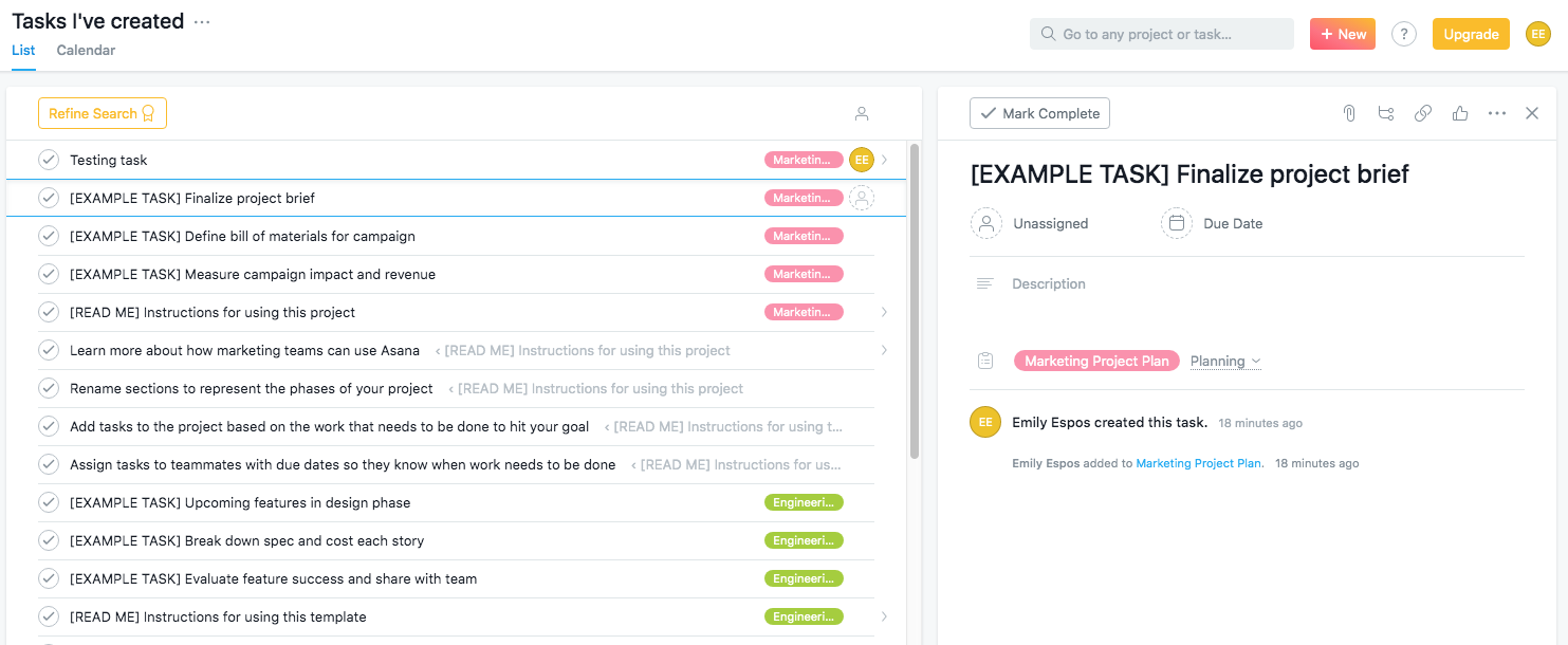
To view all tasks, Asana creates three types of reports: a list of all the tasks you've created, tasks you've assigned to others, and recently completed tasks.
Monday skews the opposite direction, with its boards showing almost too much information at the task level. At a glance, you can see owners, team, status updates (which are color-coded), timelines, and progress for each task. Of course, you can choose to delete certain columns of information in the project plan, but there isn't another obvious place to display it. While this level of detail can be overwhelming, it does do a better job of quickly conveying status updates.

However, to add new tasks in Monday, you have to find the appropriate project, open it, and fill in up to seven pieces of information. Asana requires a lower level of detail for each task, so you're able to create a new task in Asana in under ten seconds.
Asana and Monday both come with native integrations with the apps you use every day. For example, Asana integrates with Outlook, Salesforce, Adobe Creative Cloud, and more; Monday integrates with Gmail, Slack, and Zendesk, among others. And both apps integrate with Zapier, allowing you to connect them to 1,500+ other apps.
Team Management
Asana offers more advanced team management features.
Asana's most powerful team management features only apply to "organizations," which connect employees from the same company using the same email domain. Within an organization, colleagues can split into teams to collaborate on projects and tasks. Each team also has its own Team Page, a central location where you can see all your team's projects, a shared team calendar, and all conversations.
You can also collaborate with people outside your team or organization. These guests have limited permissions and can only see what is explicitly shared with them. If you have a paid organization account, these guests don't contribute to the overall membership count.
With Monday, team management is handled at the most basic level. At the account level, you can either invite a member, who can edit boards or create new ones, or a viewer, who will have read-only permissions. Like in Asana, you can also collaborate with vendors or clients outside of your team (these guests can only access shareable boards).
That's where Monday's team features end. There isn't a dedicated page for team activity nor special organizational elements for team boards.
Communication
Asana allows you to leave comments at the task, project, and team levels, whereas Monday only lets you comment on tasks.
Asana facilitates communication between your team in a variety of ways throughout the app. You can comment directly on a task or start a conversation in a dedicated window within an individual project. If you have a team page, you can also host all-team discussions and post announcements.
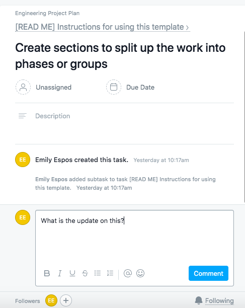
There's also an "image proofing" feature catered toward creative roles, like designers. When someone uploads an image within a task, you can click any part of the image and leave specific feedback.
Your Inbox keeps track of all this communication, alerting you when a conversation has started, when someone mentions you in a comment, or when someone interacts with your comment, among other things.
Monday, on the other hand, offers only one way to communicate with your team: at the task level. When you click any task in a project, a new window opens on the right side where you can leave updates. These updates are the primary way to communicate with other people within Monday—you can leave comments, mention other users, add GIFs, or attach files.
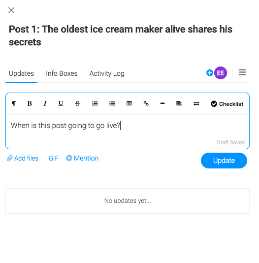
There's also an inbox within the Monday app that displays all communication on the boards you're subscribed to, even if you're not mentioned in a comment or assigned to an item.
Work Visualization
Asana offers more advanced visualization features, while Monday comes with more options for visualizing projects.
A list may not always be the best format to view information, so Asana offers a variety of other options to visualize your work. Within individual projects, you can view your tasks in a list, timeline, or calendar. You can also use the Files view to see a gallery with all the project's attachments in one place.
Asana also offers two advanced visualization features: portfolios and workload. Portfolios are real-time dashboards that aggregate key project information. Portfolios are visual in their nature, showing you details like status (with a red, green, or yellow icon), progress bars, and color-coded priority.
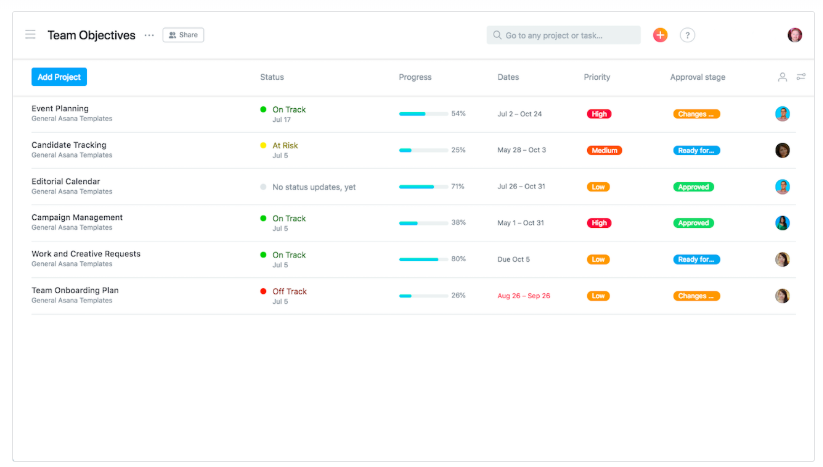
Workload lives within the portfolio feature and is Asana's take on resource management, giving you a visual snapshot of team capacity. In a chart-like dashboard, you can see each person's bandwidth across the days and times you select.
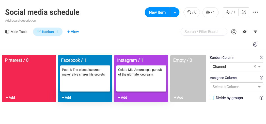
Monday offers even more visualization options at the project level, allowing you to view information in a table, timeline, kanban board, calendar, chart, or map. Monday does all the work for you, instantly transforming your project information into whichever view you select.
Monday also comes with more visual options in the project itself. Every new project defaults to a table view, to which you can add new columns for information. You can choose from a variety of column types, like color-coded status, timeline, checkbox, star rating, progress tracking, and more.
Monday vs. Asana: Which App Should You Use?
Asana and Monday are both strong project management apps that will help you organize your work and communicate with your team.
If you're working on a complex project with multiple internal and external collaborators, Asana is the clear winner. Its team management features centralize all information in one place, and advanced features like portfolios and workload allow you to accurately allocate resources.
Monday is a solid choice for smaller projects or to-do lists, where you're either working solo or with one to two other people. Monday's boards are great for displaying a lot of detail at a glance in a variety of ways (icons, colors, stars, etc).
Finally, here's an at-a-glance feature comparison:
| Asana | Monday | |
|---|---|---|
| User interface | Intuitive icons and labels to help you navigate the app | Nested menus and lack of labels make it hard to learn the interface |
| Templates | Detailed instructions in each template | Robust templates that are pre-populated with real-life content |
| Task management | Fast, streamlined task creation throughout the app | More information at a glance |
| Team management | Advanced permission levels and dedicated pages for teams | Basic features to customize permissions |
| Communication | Opportunity to communicate at the task, project, and team level | Ability to communicate at the task level |
| Work visualization | Enterprise-level visualization features | More variety of visualization features within a project |
from The Zapier Blog https://ift.tt/2KEKppu
- Get link
- X
- Other Apps
Comments
Post a Comment